IRT plots
Aiden Loe
07 January, 2021
Brief Summary
Here is a collection of plots that you can use either for publication/presentation or for an adaptive feedback.
Install and load package
library(eRm)
library(reshape)
library(dplyr)
library(ggplot2)
library(gtable)
library(gridExtra)
library(grid)
library(ggpubr)
library(mirt)
library(tidyr)
library(pander)
Normal plot (percentile)
This gives you a plot with the ith percentile ranking at the bottom.
lb=20
ub=140
lb1=40
ub1=120
lb2=60
ub2=100
lb3=79.5
ub3=80.5
mean = 80
sd = 20
limits = c(mean - 4 * sd, mean + 4 * sd)
engTheta <- 0.5
semTheta <- engSem <-0.5
dnorm <- engScore <- 70
dnorm= engScore #The location of the person's score on the y-axis.

normal_prob_area_plot <- function(dnorm=0.5,semTheta=0.5, lb=20, ub=140, lb1=40, ub1=120,lb2=60 ,ub2=100,
                                  lb3=79.5,ub3=80.5,mean = 80, sd = 20,
                                  limits = c(mean - 4 * sd, mean + 4 * sd)) {

  dnorm <- engTheta*sd+mean
  engScore <- dnorm
  semScore <- semTheta*20
  (x <- seq(limits[1], limits[2], length.out = 100))

  xmin <- max(lb, limits[1])
  xmax <- min(ub, limits[2])
  x1min <- max(lb1, limits[1])
  x1max <- min(ub1, limits[2])
  x2min <- max(lb2, limits[1])
  x2max <- min(ub2, limits[2])
  x3min <- max(lb3, limits[1])
  x3max <- min(ub3, limits[2])

  areax <- seq(xmin, xmax, length.out = 100)
  areax1 <- seq(x1min, x1max, length.out = 100)
  areax2 <- seq(x2min, x2max, length.out = 100)
  areax3 <- seq(x3min, x3max, length.out = 100)

  area <- data.frame(x = areax, ymin = 0, ymax = dnorm(areax, mean = mean, sd = sd))
  area1 <- data.frame(x = areax1, ymin = 0, ymax = dnorm(areax1, mean = mean, sd = sd))
  area2 <- data.frame(x = areax2, ymin = 0, ymax = dnorm(areax2, mean = mean, sd = sd))
  area3 <- data.frame(x = areax3, ymin = 0, ymax = dnorm(areax2, mean = mean, sd = sd))

  #adding two x- axis
  dnorm(engScore,mean,sd)
  perc <- quantile(x,seq(from = 0,to = 1,by = 1/14)) # quantile range based on x,by = 1/14, because mean is 60, sd=20. cut into 14 parts. -4 to 4.
  labels <- names(perc)
  m <- gregexpr('[0-9]+',labels)
  labels <-regmatches(labels,m)
  labels <- do.call(rbind,labels)
  (labels <- paste0(round(as.numeric(paste0(labels[,1],".",labels[,2]))),"%"))
  (perc <- round(perc,1))
  (l <- paste(perc,labels,sep = "\n"))

  f <- ecdf(x) # convert the percentile ranking
  f(engScore) # find the percentile score within the ranking

      (ggplot()
    + geom_line(data.frame(x = x, y = dnorm(x, mean = mean, sd = sd)),
                mapping = aes(x = x, y = y))
    + geom_ribbon(data = area, mapping = aes(x = x, ymin = ymin, ymax = ymax),fill="#F70025")
    + geom_ribbon(data = area1, mapping = aes(x = x, ymin = ymin, ymax = ymax),fill="#F25C00")
    + geom_ribbon(data = area2, mapping = aes(x = x, ymin = ymin, ymax = ymax),fill="#F9A603")
    + geom_ribbon(data = area3, mapping = aes(x = x, ymin = ymin, ymax = ymax),fill="black")
  +  geom_point( data=data.frame(x=dnorm,y=dnorm(dnorm, mean,sd)), aes(x,y), color="blue", size=3) #person's theta
        + geom_errorbarh(aes(xmax = (dnorm+semScore), xmin = (dnorm-semScore), x=dnorm,y=dnorm(dnorm, mean,sd)),height = .001,color="blue",size=1)
    + scale_x_continuous(limits = limits)
  + xlab("Standardized Score / Percentile Rank") + ylab("Probability Density")  +   scale_x_continuous(breaks=perc, labels= l) +
   theme( plot.title = element_text(lineheight=1 ,size = rel(2), color="white"),
           axis.title.x = element_text(size=12, color="black"),
           axis.title.y = element_text(size=12, color="black"),
           axis.text.x = element_text(colour="black", size="10"),
           axis.text.y = element_text(colour="black", size="10"),
           #axis.text.y = element_blank(),
            axis.ticks.x = element_line(colour="black"),
          # axis.ticks.y =element_blank(),
           plot.background = element_rect(fill = "white", size=3),
           panel.background = element_rect(fill = "white"),
           panel.border = element_rect(fill=NA,color="black", size=.5, linetype="solid"),
           panel.grid.major = element_blank(), panel.grid.minor = element_blank()))


}

normal_prob_area_plot(dnorm=engTheta,semTheta=engSem)
## Warning: Ignoring unknown aesthetics: x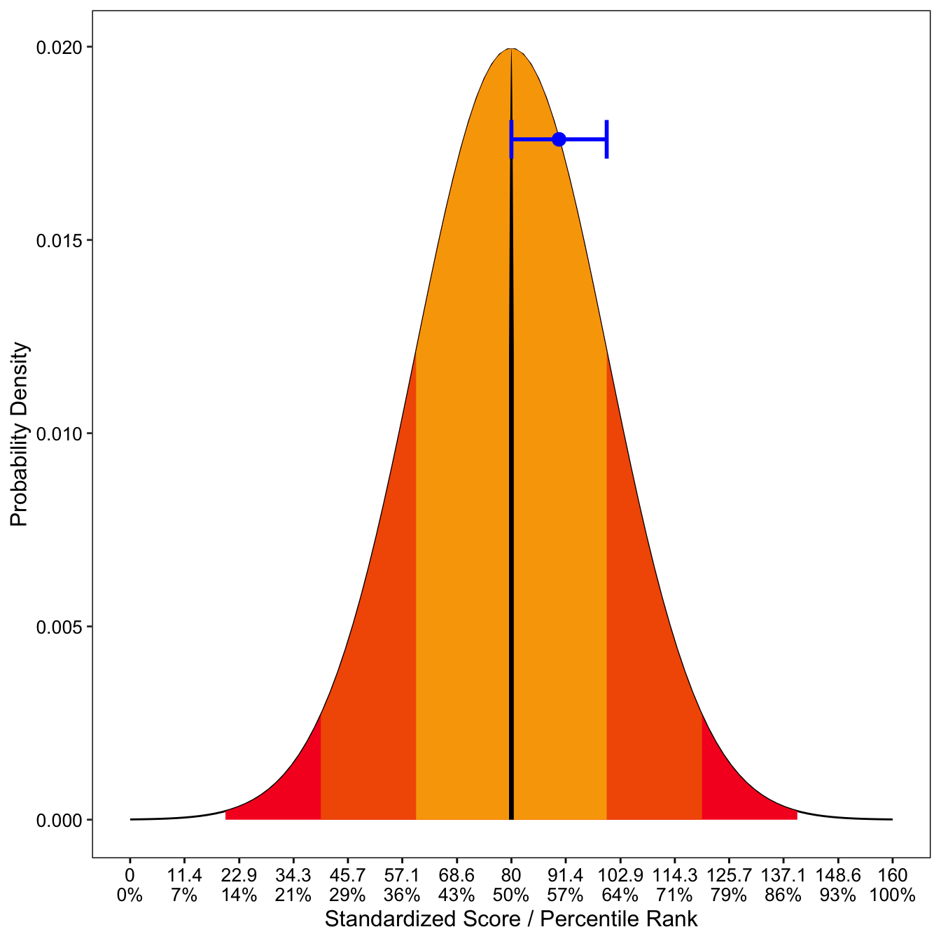
Normal plot (standardized)
This gives you a plot with the z score.
#adjusting to mean =80 and sd = 20
engTheta <--4 # zscore
engScore <- (engTheta*20) + 80 # standardizd score with mean = 80, sd = 20
mean =80; sd = 20
limits = c(mean - 4 * sd, mean + 4 * sd)
x <- seq(limits[1], limits[2], length.out = 100)
f <- ecdf(x) # convert the percentile ranking
percentile <- f(engScore) # find the percentile score within the ranking

lb=-3
ub=3
lb1=-2
ub1=2
lb2=-1
ub2=1
lb3=-0.1
ub3=0.1
mean = 0
sd = 1
engTheta <- -1
semTheta=-0.5
limits = c(mean - 4 * sd, mean + 4 * sd) # creating a range vector
dnorm = engTheta # to get position on y -axis
#pnorm(engScore, mean = 80, sd =20) # to get person's score
f <- ecdf(x)

# plot is based on mean = 0 and sd= 1
normal_prob_area_plotZ <- function(dnorm= engTheta, semTheta= semTheta, lb=-3, ub=3, lb1=-2, ub1=2,lb2=-1 ,ub2=1,
                                  lb3=-0.05,ub3=0.05,mean = 0, sd = 1,
                                  limits = c(mean - 4 * sd, mean + 4 * sd)) {
  x <- seq(limits[1], limits[2], length.out = 100)

  xmin <- max(lb, limits[1])
  xmax <- min(ub, limits[2])
  x1min <- max(lb1, limits[1])
  x1max <- min(ub1, limits[2])
  x2min <- max(lb2, limits[1])
  x2max <- min(ub2, limits[2])
  x3min <- max(lb3, limits[1])
  x3max <- min(ub3, limits[2])

  areax <- seq(xmin, xmax, length.out = 100)
  areax1 <- seq(x1min, x1max, length.out = 100)
  areax2 <- seq(x2min, x2max, length.out = 100)
  areax3 <- seq(x3min, x3max, length.out = 100)

  area <- data.frame(x = areax, ymin = 0, ymax = dnorm(areax, mean = mean, sd = sd))
  area1 <- data.frame(x = areax1, ymin = 0, ymax = dnorm(areax1, mean = mean, sd = sd))
  area2 <- data.frame(x = areax2, ymin = 0, ymax = dnorm(areax2, mean = mean, sd = sd))
  area3 <- data.frame(x = areax3, ymin = 0, ymax = dnorm(areax2, mean = mean, sd = sd))

  (ggplot()
  + geom_line(data.frame(x = x, y = dnorm(x, mean = mean, sd = sd)),
              mapping = aes(x = x, y = y))
    + geom_line(data.frame(x = x, y = dnorm(x, mean = mean, sd = sd)), mapping = aes(x = x, y = y))
    + geom_ribbon(data = area, mapping = aes(x = x, ymin = ymin, ymax = ymax),fill="#07575b")
    + geom_ribbon(data = area1, mapping = aes(x = x, ymin = ymin, ymax = ymax),fill="#66A5AD")
    + geom_ribbon(data = area2, mapping = aes(x = x, ymin = ymin, ymax = ymax),fill="#C4DFE6")
    + geom_ribbon(data = area3, mapping = aes(x = x, ymin = ymin, ymax = ymax),fill="black")
    +  geom_point( data=data.frame(x=dnorm,y=dnorm(dnorm, mean,sd)), aes(x,y), color="red", size=2) #person's theta
    + geom_errorbarh(aes(xmax = dnorm + semTheta, xmin = dnorm - semTheta, x=dnorm,y=dnorm(dnorm, mean,sd)),height = .01,color="red",size=1)
    + scale_x_continuous(limits = limits)
    + xlab("Z-score") + ylab("Probability Density")  +
      theme( plot.title = element_text(lineheight=1 ,size = rel(2), color="white"),
             axis.title.x = element_text(size=10, color="black"),
             axis.title.y = element_text(size=10, color="black"),
             axis.text.x = element_text(colour="black", size="10"),
             axis.text.y = element_text(colour="black", size="10"),
             #axis.text.y = element_blank(),
             axis.ticks.x = element_line(colour="black"),
             # axis.ticks.y =element_blank(),
             plot.background = element_rect(fill = "white", size=3),
             panel.background = element_rect(fill = "white"),
             panel.border = element_rect(fill=NA,color="black", size=.5, linetype="solid"),
             panel.grid.major = element_blank(), panel.grid.minor = element_blank()))


}
normal_prob_area_plotZ(2,semTheta=semTheta)
## Warning: Ignoring unknown aesthetics: x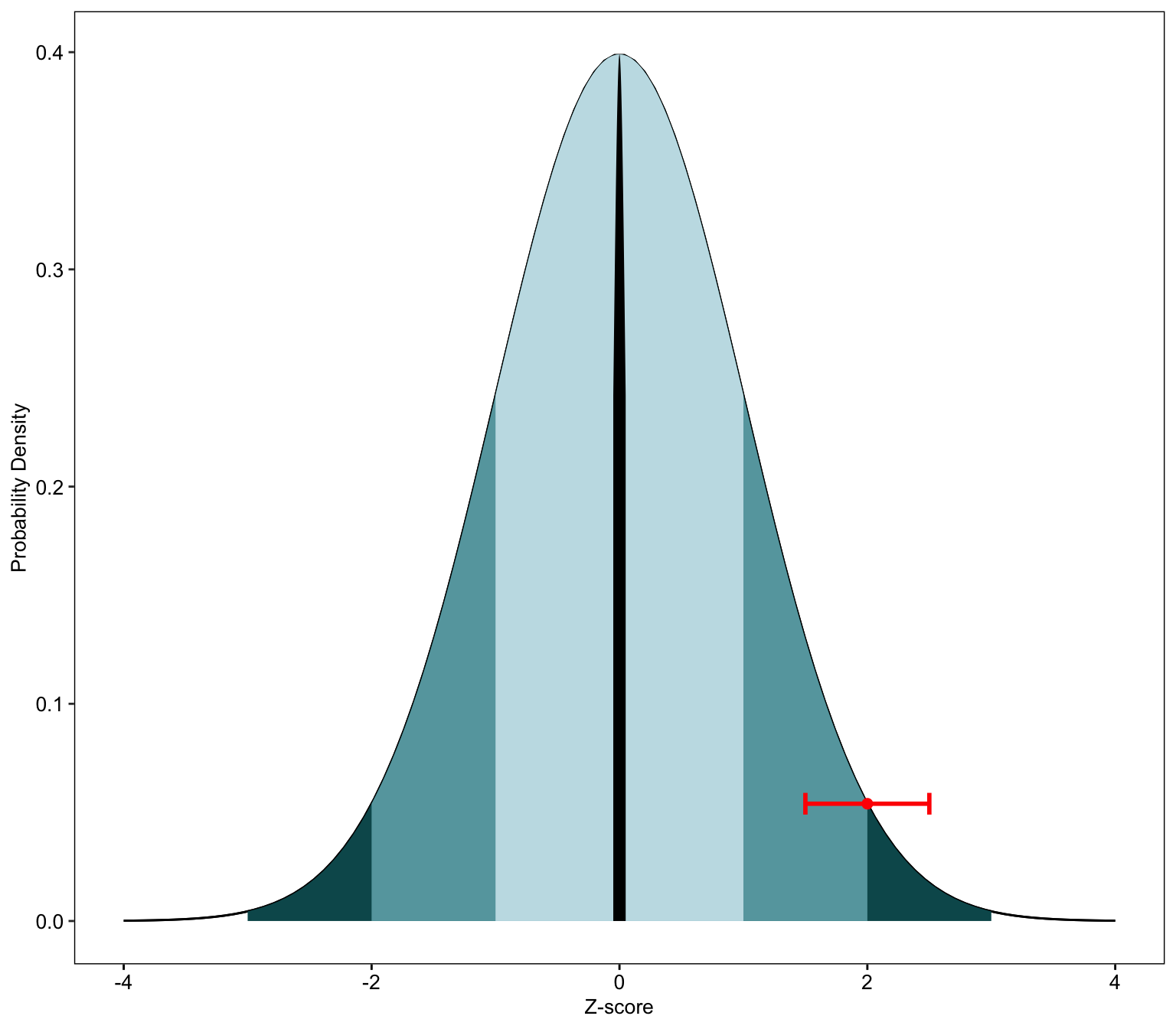
On-the-fly Normal plot
This is useful if you want to create a on-the-fly normal plot display.
For example, if you create an adaptive test, you can use this code to help generate a nice feedback at the end.
############## Percentile ###################

a <-  rnorm(100)

onTheFlyPlot <- function(dataset, quantiles){
dens <- density(a)
scoreDensity <- data.frame(x=dens$x,  y=dens$y) # convert to data frame

theta <- length(a)
theta.last.person <-  a[theta] #summed score of last person
findInterval(scoreDensity$x, theta.last.person)
scoreDensity$percentile <- factor(findInterval(scoreDensity$x, theta.last.person))

# Person's Percentile
f <- ecdf(a) # create culminate distribution (vector) based on values before converting to density
percentile <- f(theta.last.person) # returns the specific person percentile.

 #quantile blocks to insert for x axis coordinates.
  probs <- c(0.01, 0.25, 0.5, 0.75,0.99)
 # quantiles <- quantile(finalCATscores$theta, prob=probs) # based on data frame before converting to density
  quantiles <- quantile(a, prob=probs)

your_percentile <- round(f(theta.last.person)*100, 2) # specific value of the last person in percentile

#plot
p <- ggplot(scoreDensity, aes(x,y)) + geom_line()  + geom_ribbon(aes(ymin=0, ymax=y, fill=percentile)) +
   scale_fill_manual(values=c( "#64FFDA","#FFCC80")) +  scale_x_continuous(breaks=quantiles) + xlab("Percentile") + ylab("Probability Density") +
  theme( plot.title = element_text(lineheight=1 ,size = rel(2), color="white"),
          axis.title.x = element_text(size=12, color="black"),
         axis.title.y = element_text(size=12, color="black"),
          axis.text.x = element_text(colour="black", size="12"),
          axis.text.y = element_text(colour="black", size="12"),
          #axis.text.y = element_blank(),
            axis.ticks.x = element_line(colour="black"),
         # axis.ticks.y =element_blank(),
          plot.background = element_rect(fill = "white", size=3),
          panel.background = element_rect(fill = "white"),
          panel.border = element_rect(fill=NA,color="black", size=.5, linetype="solid"),
         # panel.grid.major = element_blank(), panel.grid.minor = element_blank(),
          legend.position="none")
return(p)
}
onTheFlyPlot(dataset = scoreDenstiy, quantiles = quantiles)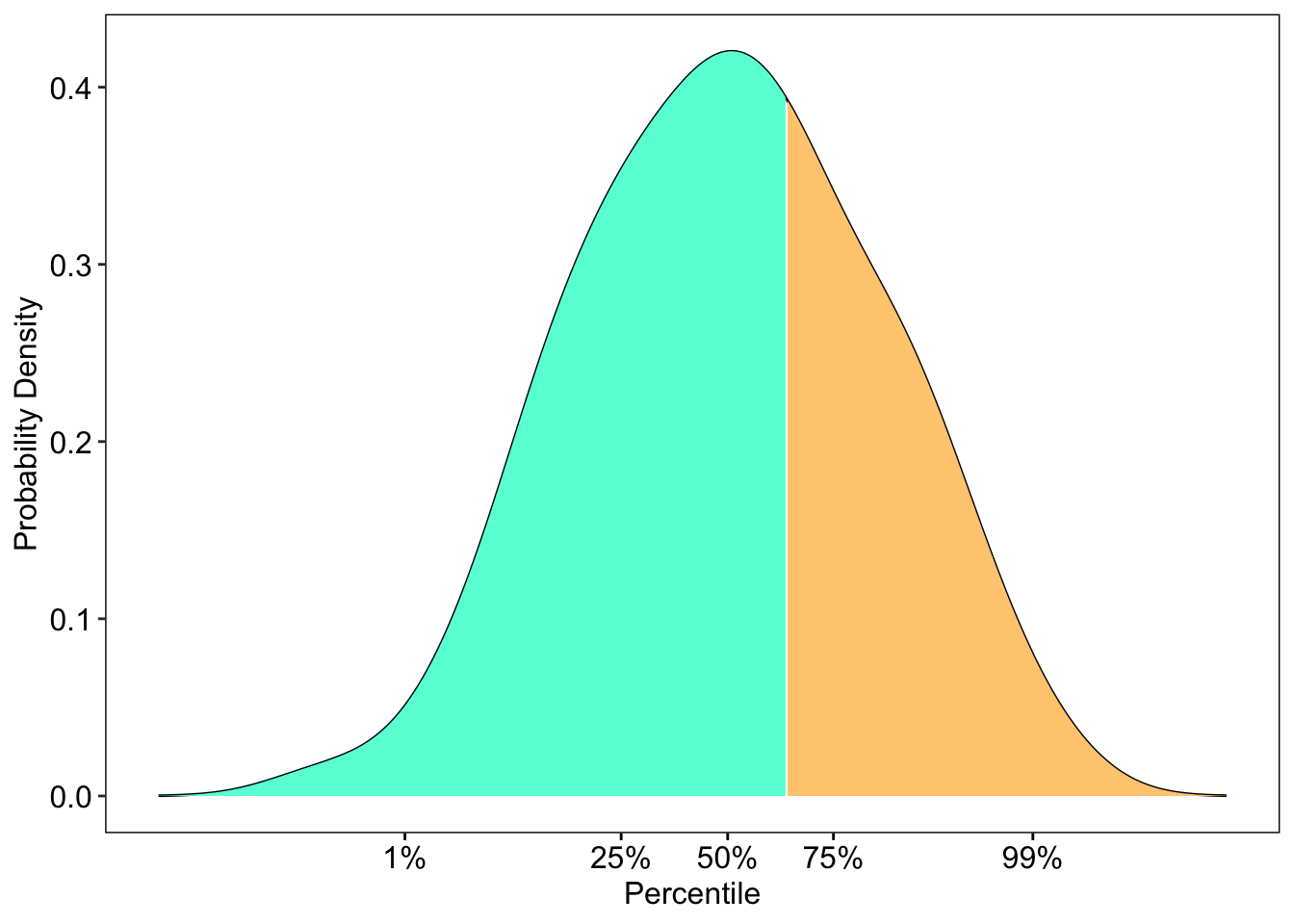
Test Information plot
This helps to create a test information plot that is of publishable quality.
You will need the eRm,grid,gtable packages.
fit <- PCM(pcmdat) # running irt model (partial credit model)

# test_info() is used to get the information
# then it is pipped through as a data.frame
tI<- test_info(fit, theta=seq(-4,4,0.01)) %>% as.data.frame
se<- 1/(sqrt(tI)) #get the standard error
tI<- cbind.data.frame(tI,seq(-6,6,length.out=801), se) #make sure they are the same length
colnames(tI) <- c("information", "xAxis","se")
p1 <- ggplot(tI, aes(x=xAxis, y=information, colour="black")) + geom_line()  + theme_bw() +
  scale_colour_identity(name="", guide="legend", labels=c("Information")) +
  theme(panel.grid.major = element_blank(), panel.grid.minor = element_blank(),
        panel.background = element_blank(), axis.line = element_blank(),
        axis.text=element_text(size=14),
        axis.title=element_text(size=14),
        legend.text=element_text(size=14),
        legend.title=element_text(size=14),
        plot.title = element_text(hjust = 0.5, size=16, face="bold"),
        legend.position="bottom") +
  labs(x="\nTheta", y = "Information\n") +
  scale_x_continuous(breaks=c(-6,-4,-2,0,2,4,6)) +ggtitle("Test Information Curve\n")


p2 <- ggplot(tI, aes(x=xAxis, y=se, colour="red"))  + geom_line(linetype = "dashed") + theme_bw() +
  scale_colour_identity(name="", guide="legend", labels=c("SE")) +
  theme(panel.grid.major = element_blank(), panel.grid.minor = element_blank(),
        panel.background = element_blank(), axis.line = element_blank(),
        axis.text=element_text(size=13),
        axis.title=element_text(size=13),
        axis.text.y = element_text(colour = "red"),
        legend.text=element_text(size=13),
        legend.title=element_text(size=13),
        legend.position="bottom")+
  scale_x_continuous(breaks=c(-6,-4,-2,0,2,4,6))


# extract gtable
g1 <- ggplot_gtable(ggplot_build(p1))
g2 <- ggplot_gtable(ggplot_build(p2))

# overlap the panel of 2nd plot on that of 1st plot
pp <- c(subset(g1$layout, name == "panel", se = t:r))
g <- gtable_add_grob(g1, g2$grobs[[which(g2$layout$name == "panel")]], pp$t,
                     pp$l, pp$b, pp$l)

# axis tweaks
ia <- which(g$layout$name == "ylab")
ia <- which(g2$layout$name == "axis-l")
ga <- g2$grobs[[ia]]
ax <- ga$children[[2]]
ax$widths <- rev(ax$widths)
ax$grobs <- rev(ax$grobs)
ax$grobs[[1]]$x <- ax$grobs[[1]]$x - unit(1, "npc") + unit(0.08, "cm")
g <- gtable_add_cols(g, g2$widths[g2$layout[ia, ]$l], length(g$widths) - 1)
g <- gtable_add_grob(g, ax, pp$t, length(g$widths) - 1, pp$b)

# extract legend
leg1 <- g1$grobs[[which(g1$layout$name == "guide-box")]]
leg2 <- g2$grobs[[which(g2$layout$name == "guide-box")]]

g$grobs[[which(g$layout$name == "guide-box")]] <-
  gtable:::cbind_gtable(leg1, leg2, "first")

# draw it
grid.draw(g)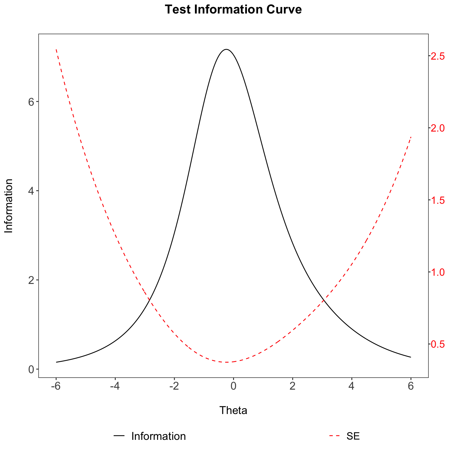
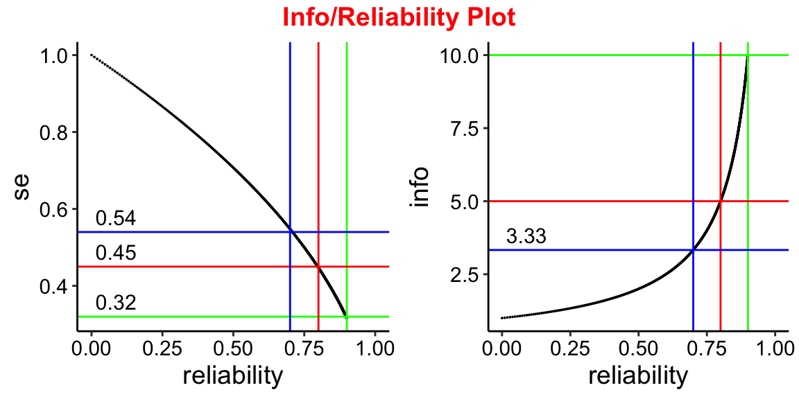
Info/Reliability plot
To see how this reliability changes over a range of test information values.
You will need the ggplot and ggpubr packages.
# range of info/reliability values
info <- seq(1,10, 0.01)
se <- 1/sqrt(info)
reliability <- 1-se^2
reli <- cbind.data.frame(info, se, reliability)

# plots
plot1 <- ggplot(reli, aes(x=reliability, y =se )) + geom_point(size=0.01) + theme_classic() +
  xlim(0,1.0) +
  geom_vline(aes(xintercept=0.9), colour = "green") +
  geom_hline(aes(yintercept=0.32),colour = "green") +
  ggplot2::annotate(geom="text", label=0.32, x=0, y=0.32, vjust=-0.5,hjust=-0.1, size=4) +
  geom_vline(aes(xintercept=0.8), colour = "red") +
  geom_hline(aes(yintercept=0.45),colour = "red") +
  ggplot2::annotate(geom="text", label=0.45, x=0, y=0.45, vjust=-0.5,hjust=-0.1, size=4) +
  geom_vline(aes(xintercept=0.7),colour = "blue") +
  geom_hline(aes(yintercept=0.54), colour = "blue") +
  ggplot2::annotate(geom="text", label=0.54, x=0, y=0.54, vjust=-0.5,hjust=-0.1, size=4) +
  theme(text = element_text(size=14),
        axis.text.x=element_text(colour="black"),
        axis.text.y=element_text(colour="black"))

plot2 <- ggplot(reli, aes(x=reliability, y = info)) + geom_point(size=0.01) +
  theme_classic() + xlim(0,1.0) +
  geom_vline(aes(xintercept=0.9), colour = "green") +
  geom_hline(aes(yintercept=10),colour = "green") +
  geom_vline(aes(xintercept=0.8), colour = "red") +
  geom_hline(aes(yintercept=5),colour = "red") +
  geom_vline(aes(xintercept=0.7),colour = "blue") +
  geom_hline(aes(yintercept=3.33), colour = "blue") +
  ggplot2::annotate(geom="text", label=3.33, x=0, y=3.33, vjust=-0.5,hjust=-0.1, size=4) +
  theme(text = element_text(size=14),
        axis.text.x=element_text(colour="black"),
        axis.text.y=element_text(colour="black"))
plot2

#combine plots together
plot3 <- ggarrange(plot1, plot2,
          ncol = 2, nrow = 1)

annotate_figure(plot3,
                top = text_grob("Info/Reliability Plot",
                                color = "red", face = "bold",
                                size = 14))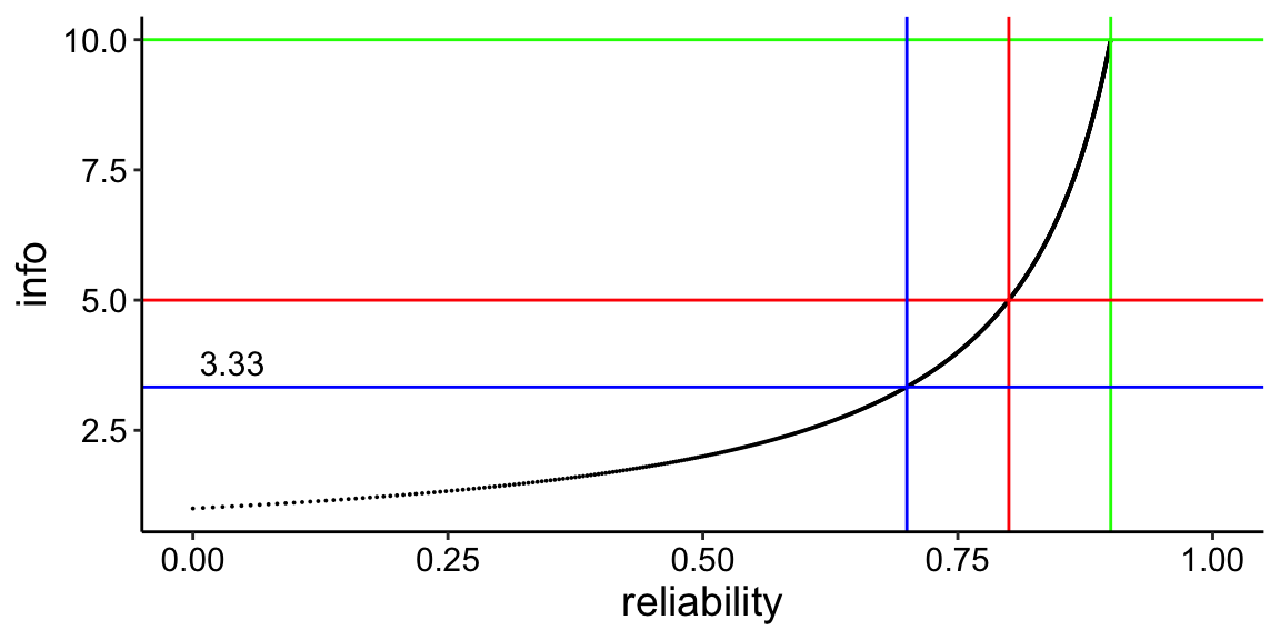
ICC plot by difficulty level
While colour coding may be helpful, it actually repeats itself after a few times.
Hence, the best way is to order the items in the data so that they are ranked by difficulty level.
So far, mirt and the other packages doesn’t have the functionality to do that yet.
You will need the mirt, ggplot and dplyr packages.
library(mirt)
dat <- expand.table(LSAT7)
mod <- mirt(dat, 1, verbose=FALSE)

# Extract all items
# Compute the probability trace lines
# Put into a list
traceline <- NULL
for(i in 1:length(dat)){
extr.2 <- extract.item(mod, i)
Theta <- matrix(seq(-4,4, by = .1))
traceline[[i]] <- probtrace(extr.2, Theta)
}

# rename list
names(traceline) <- paste('item',1:length(traceline))

# rbind traceline
traceline.df <- do.call(rbind, traceline)

# create item names length based on length of theta provided
item <- rep(names(traceline),each=length(Theta))

# put them all together into a dataframe
l.format <- cbind.data.frame(Theta, item, traceline.df)


l.format$item<-as.factor(l.format$item)
aux<-l.format %>%
  group_by(item) %>%
  slice(which.min(abs(P.1-0.5))) # We are only using the P.1 column (dichotomous)

aux<-aux[order(aux$Theta),]
ord<-as.integer(aux$item)
l.format$item = factor(l.format$item,levels(l.format$item)[ord])

# plot chart
ggplot(l.format, aes(Theta, P.1, colour = item)) +
  geom_line() +
  ggtitle('Probability Tracelines') +
  xlab(expression(theta)) +
  ylab(expression(P(theta))) +
  geom_hline(aes(yintercept = 0.5)) + theme_bw() +
  theme(text = element_text(size=16),
        axis.text.x=element_text(colour="black"),
        axis.text.y=element_text(colour="black"),
        legend.title=element_blank())
Categorical response curve plot
The code below will let you to either plot one Categorical Response Curves at a time or plot all the items together.
It is rather messy to plot all the items together. I would recommend each item to have its own separate plot.
You will need mirt ,ggplot2 and tidyr packages to run this demo.
data(Science)
mod <- mirt(Science,1, itemtype='graded', verbose=FALSE)

# Extract all items
# Compute the probability trace lines
# Put into a list
traceline <- NULL
for(i in 1:length(Science)){
  extr.2 <- extract.item(mod, i)
  Theta <- matrix(seq(-6,6, by = .1))
  traceline[[i]] <- probtrace(extr.2, Theta)
}

names(traceline) <- paste('item',1:length(traceline))

# rbind traceline
traceline.df <- do.call(rbind, traceline)

# create item names length based on length of theta provided
item <- rep(names(traceline),each=length(Theta))

# put them all together into a dataframe
l.format <- cbind.data.frame(Theta, item, traceline.df)

# wide to long format.
longer.format <- gather(l.format,categorials,measurement,P.1:P.4)
longer.format$item<-as.factor(longer.format$item)

# Selecting item
items <- c("item 1", "item 2", "item 3", "item 4")
item.format <-longer.format[longer.format$item == items[1],]

# plot chart
ggplot(item.format, aes(Theta, measurement, colour = item, fill=categorials)) +
  geom_line() +
  ggtitle('Polytomous Tracelines') +
  xlab(expression(theta)) +
  ylab(expression(P(theta))) +
  geom_hline(aes(yintercept = 0.5)) + theme_bw() +
  theme(text = element_text(size=16),
        axis.text.x=element_text(colour="black"),
        axis.text.y=element_text(colour="black"),
        legend.title=element_blank())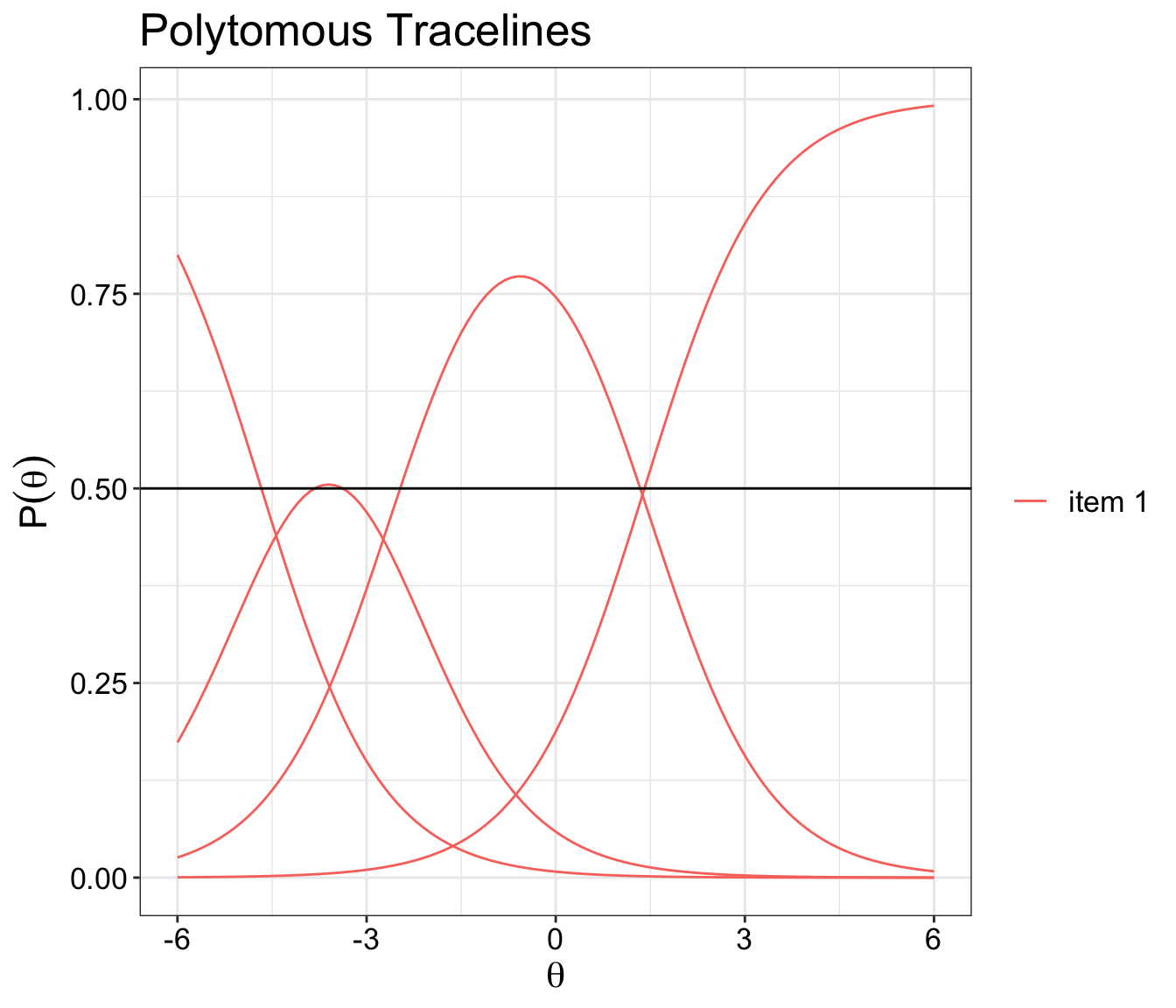
OCC plot for polytomous items
The code below will let you plot an item Operating Characteristic Curve one at a time.
I would recommend each item to have its own separate plot rather than putting it all together.
Thanks to Phil Chalmers who helped with the initial coding bit.
You will need mirt ,ggplot2 and tidyr packages to run this demo.
model <- mirt(Science, 1, itemtype="gpcm", verbose=FALSE)
cfs <- coef(model, IRTpars = TRUE, simplify=TRUE)$items

# 2pl
twopl <- function(a, b, theta){
  1 / (1 + exp(-(a * (theta - b))))}

# theta
theta <- seq(-4,4,.1)

# select item to display OCC
item <- 3

# create Operational characteristic curve
lst <- list()
for(i in 1:3) lst[[i]] <- twopl(a=cfs[item,1], b=cfs[item,i+1], theta=theta)

dat <- data.frame(theta, as.data.frame(lst))
names(dat) <- c('theta', 'b1', 'b2', 'b3')

# wide to long format.
longer.format <- gather(dat,categorials,measurement,b1:b3)

# Plot item trace line (mirt package)
plot(model, type="trace")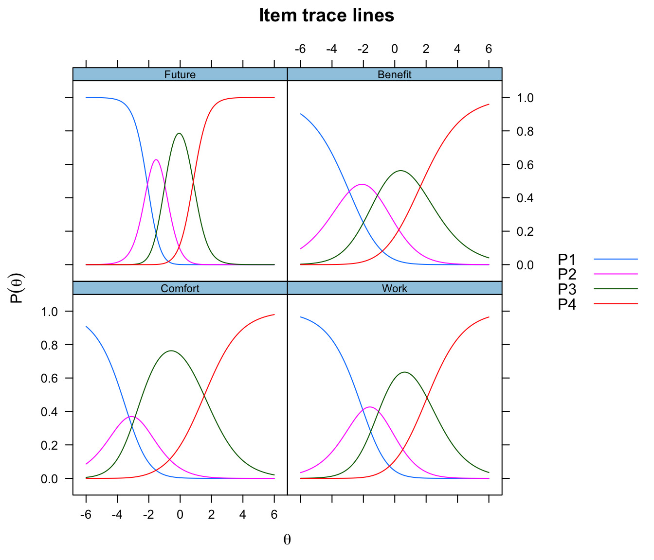
# Item Parameter Estimates table
itemPar <- cfs
pander(itemPar, plain.ascii = TRUE, caption = "Item par estimates")| a | b1 | b2 | b3 | |
|---|---|---|---|---|
| Comfort | 0.8653 | -3.271 | -2.882 | 1.533 |
| Work | 0.8409 | -2.034 | -1.032 | 2.058 |
| Future | 2.204 | -2.087 | -0.9791 | 0.8352 |
| Benefit | 0.7238 | -2.9 | -1.105 | 1.627 |
# plot chart
ggplot(longer.format, aes(theta, measurement, colour=categorials)) +
  geom_line() +
  ggtitle(paste('OCC Plot for Item', rownames(cfs)[item])) +
  xlab(expression(theta)) +
  ylab(expression(P(theta))) +
  geom_vline(aes(xintercept = cfs[item,2]), color='red') +
  geom_vline(aes(xintercept = cfs[item,3]), color="green") +
  geom_vline(aes(xintercept = cfs[item,4]), color='blue') +
  geom_hline(aes(yintercept = 0.5)) + theme_bw() +
  theme(text = element_text(size=16),
        axis.text.x=element_text(colour="black"),
        axis.text.y=element_text(colour="black"),
        legend.title=element_blank())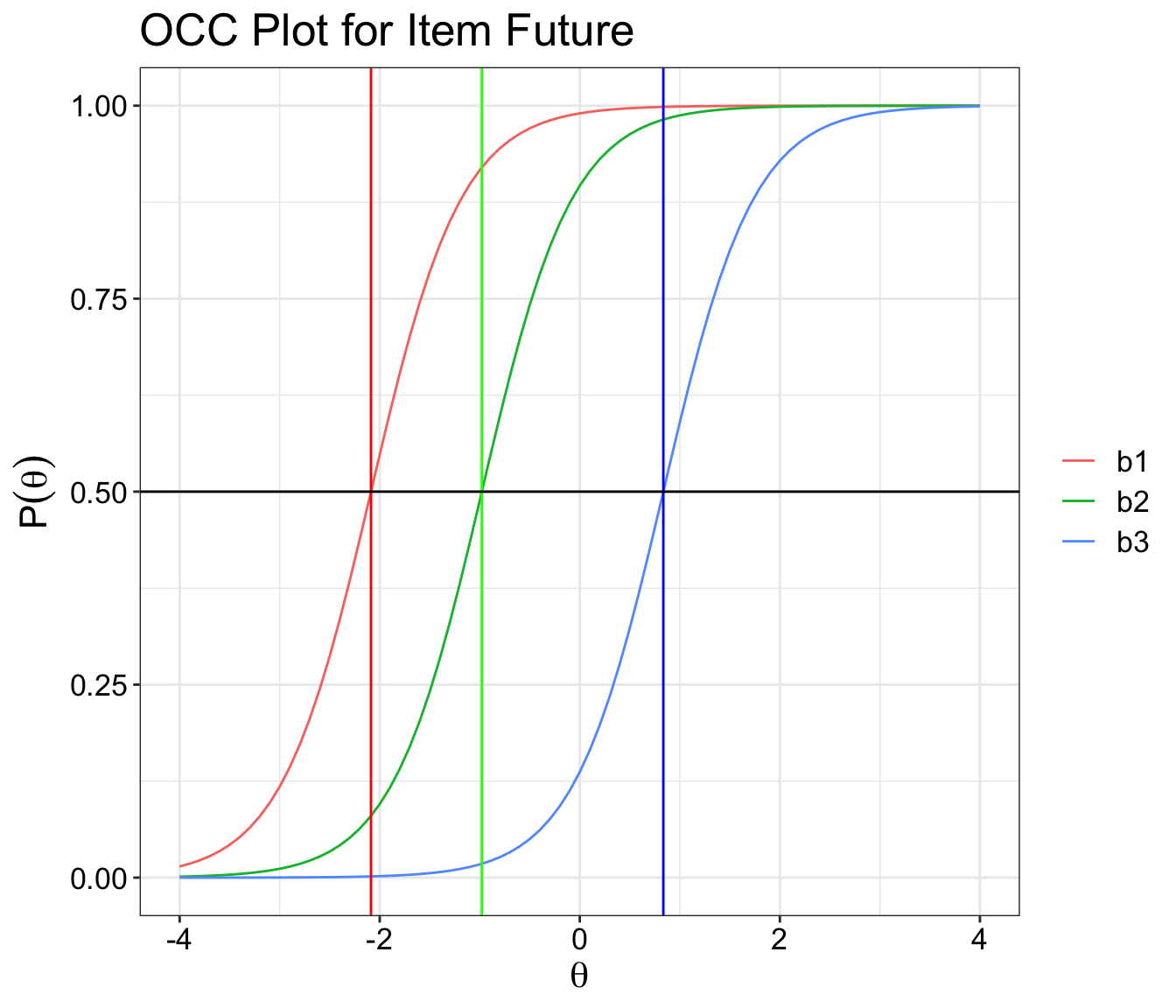
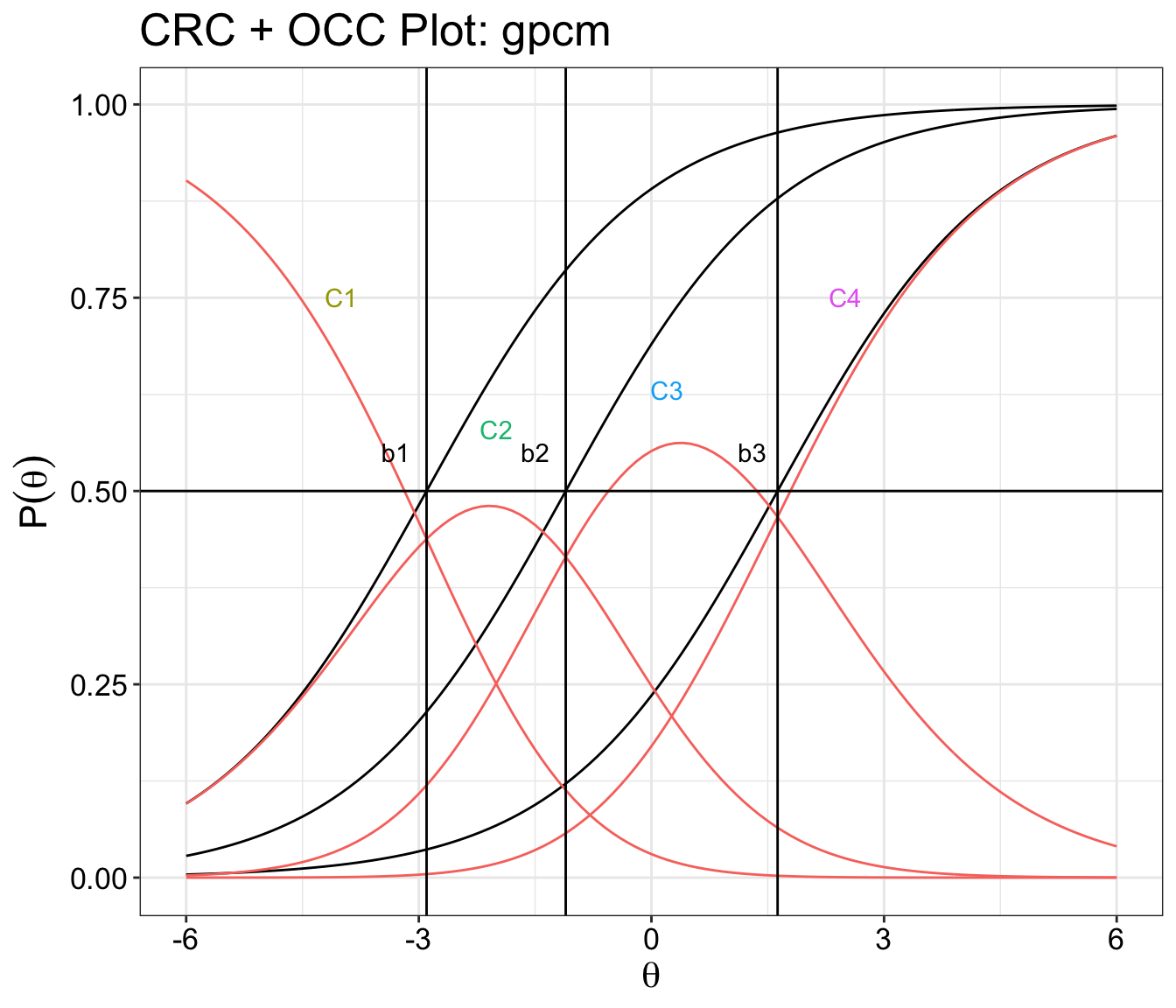
CRC and OCC plot combined
Categorical response curve and operating characteristic curve plots overlap one another.
data(Science)
itemtype <- 'gpcm'
mod <- mirt(Science,1, itemtype=itemtype, verbose=FALSE)

# select item to display CRC and OCC
itemSelected <- 4

# Extract all items
# Compute the probability trace lines
# Put into a list
traceline <- NULL
for(i in 1:length(Science)){
  extr.2 <- extract.item(mod, i)
  Theta <- matrix(seq(-6,6, by = .1))
  traceline[[i]] <- probtrace(extr.2, Theta)
}

names(traceline) <- paste('item',1:length(traceline))

# rbind traceline
traceline.df <- do.call(rbind, traceline)

# create item names length based on length of theta provided
item <- rep(names(traceline),each=length(Theta))

# put them all together into a dataframe
l.format <- cbind.data.frame(Theta, item, traceline.df)

# wide to long format.
longer.format <- gather(l.format,categorials,measurement,P.1:P.4)
longer.format$item<-as.factor(longer.format$item)

# Selecting items
items <- c("item 1", "item 2", "item 3", "item 4")

item.format <-longer.format[longer.format$item == items[itemSelected],]

# item coefficient
cfs <- coef(mod, IRTpars = TRUE, simplify=TRUE)$items

# 2pl
twopl <- function(a, b, theta){
  1 / (1 + exp(-(a * (theta - b))))}

# theta
theta <- seq(-6,6,.1)

# create Operational characteristic curve
lst <- list()
for(i in 1:3) lst[[i]] <- twopl(a=cfs[itemSelected,1], b=cfs[itemSelected,i+1], theta=theta)

dat <- data.frame(theta, as.data.frame(lst))
names(dat) <- c('Theta', 'b1', 'b2', 'b3')

# wide to long format.
longer.format <- gather(dat,categorials,measurement,b1:b3)

# Item Parameter Estimates table
itemPar <- cfs

# plot chart
ggplot() +
  geom_line(data=longer.format, aes(Theta, measurement, fill=categorials)) +
  geom_line(data=item.format, aes(Theta, measurement, colour = item,fill=categorials)) +
  ggtitle(paste("CRC + OCC Plot:",itemtype)) +
  xlab(expression(theta)) +
  ylab(expression(P(theta))) +
  geom_vline(aes(xintercept = cfs[itemSelected,2]), color='black') +
  geom_vline(aes(xintercept = cfs[itemSelected,3]), color="black") +
  geom_vline(aes(xintercept = cfs[itemSelected,4]), color='black') +
  geom_hline(aes(yintercept = 0.5), color="black") + theme_bw() +
  theme(text = element_text(size=16),
        axis.text.x=element_text(colour="black"),
        axis.text.y=element_text(colour="black"),
        legend.title=element_blank(),
        legend.position="hide") +
  geom_text(aes(x = -3.3, y = 0.55, label = "b1")) +
  geom_text(aes(x = -1.5, y = 0.55, label = "b2")) +
  geom_text(aes(x = 1.3, y = 0.55, label = "b3")) +
  geom_text(aes(x = -4, y = 0.75, label = "C1", color="P.1")) +
  geom_text(aes(x = -2, y = 0.58, label = "C2", color="P.2")) +
  geom_text(aes(x = 0.2, y = 0.63, label = "C3", color="P.3")) +
  geom_text(aes(x = 2.5, y = 0.75, label = "C4", color="P.4"))